How I Prototyped Six Dyslexia Fonts From My Phone by Directing AI Agents
By MobileVibe Team · July 22, 2026 · 5 min read
How I Prototyped Six Dyslexia Fonts From My Phone by Directing AI Agents
The idea arrived at the worst possible time to act on it: late at night, mid-conversation, nowhere near my desk. Someone at a forum was describing phonological dyslexia - the kind where the hard part is mapping speech sounds to written letters, and where vowels especially are where things break down. I had a hunch. What if the vowels in a font were shaped to look different from the consonants, not just colored differently? Could the letterforms themselves do some of the work?
A few years ago that hunch would have gone into a notebook and died there. Instead I pulled out my phone, pointed a Claude Code agent at the problem, and by the time I went to bed I had the first experimental font building. Over the weekend I had six. This is a small story, but it’s the clearest example I have of why running agents from your phone changes which ideas actually get built.
Quick answer
Rapid prototyping with AI agents means turning a vague hunch into a testable artifact in hours instead of weeks - often without sitting down at your desk. I generated six experimental font variations by describing each one to a coding agent running on my machine and steering it from my phone through MobileVibe. The point isn’t that the fonts are proven; it’s that the cost of finding out dropped low enough to just try.
The hunch: make vowels visually distinct
Existing dyslexia typefaces like OpenDyslexic do real, thoughtful work - weighted bottoms so letters don’t flip, extra spacing so they don’t crowd. But they treat every letter the same way. My question was narrower and, as far as I could tell, untested: for readers whose specific difficulty is vowels, what happens if the vowels are set apart by form rather than by highlight color?
Color highlighting has an obvious problem - it doesn’t survive black-and-white printing, it clashes with everything, and it screams “special.” Letterform changes are quieter and travel anywhere the font goes. So the design space I wanted to explore was: how many different ways can you make a vowel feel distinct while keeping text readable?
Six variations, one weekend
I didn’t know which approach would feel best, so I built several and compared. Each one was a short conversation with an agent - describe the transformation, let it modify the font, look at a specimen, adjust:
- VoDy Small - vowels rendered noticeably smaller than the consonants around them.
- VoDy Big - the opposite: vowels enlarged so they anchor each syllable.
- VoDy High - vowels shifted up off the baseline so they sit at a different height.
- VoDy Space - extra breathing room added around every vowel.
- VoDy Shaped - vowels given distinct structural treatments in the letterform itself.
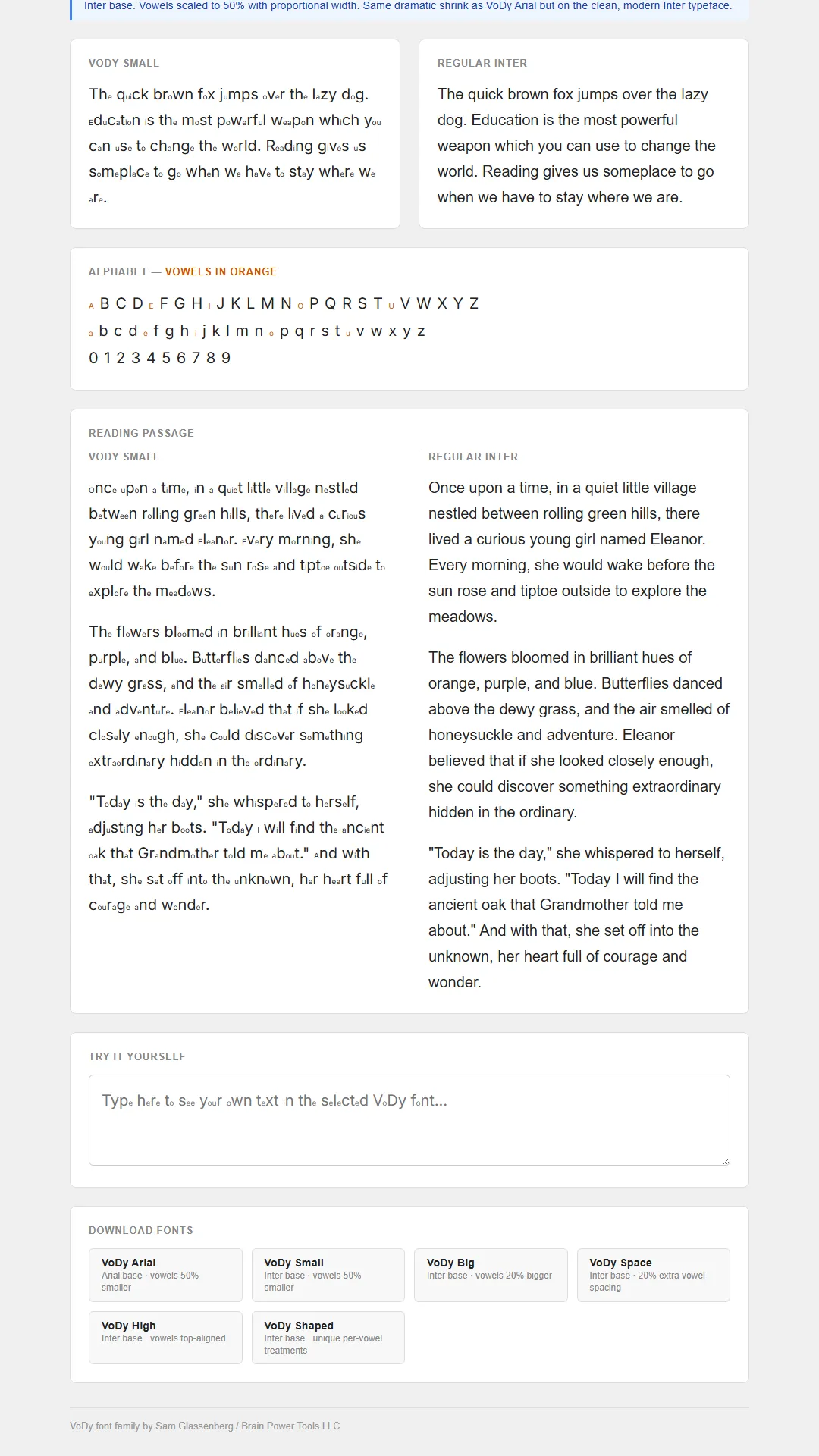 The six experimental variations side by side - each makes the vowels distinct in a different way.
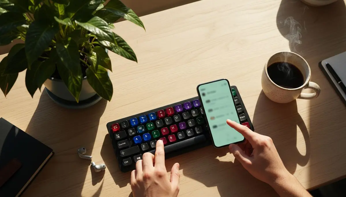
Working from my phone actually suited this. Font design is a look-and-judge loop, not a heavy-typing loop. I’d describe a change, the agent would apply it on my machine, I’d glance at the rendered specimen, and I’d say “smaller” or “try shifting the x-height.” My role was taste and direction; the agent handled the fiddly font-tooling mechanics. That division of labor is exactly what directing agents instead of writing code looks like in practice.
Why this only works when the loop is fast
Six variations is the important number. If each font had cost me a day of wrestling with font-editing software, I’d have built one, convinced myself it was fine, and stopped. I’d never have discovered that a different approach felt better, because I’d never have built the alternative to compare against.
Cheap iteration doesn’t just make you faster at building the thing you planned - it changes what you plan. When trying a variation costs an hour, you try five and let the good one reveal itself. When it costs a week, you commit early to your first guess and defend it. Almost every interesting exploratory project I’ve done in the last year has depended on getting that per-iteration cost low enough that comparison becomes cheap.
Being honest about what this is
I want to be clear-eyed here: this is an experiment, not a claim. There’s no research yet showing these fonts help anyone, and shaping vowels differently could just as easily hurt readability as help it. I’m a builder with a hunch, not a vision scientist with a study.
But that’s exactly why fast prototyping matters. The right response to an untested hunch isn’t a research grant - it’s a cheap artifact you can put in front of real people. I released the six fonts free and asked people with phonological dyslexia to try them and tell me what, if anything, felt different. Some will be useless. Maybe one won’t be. The only way to find out is to have built them, and the only reason I built them is that the cost of doing so had fallen to almost nothing.
The takeaway
The reason to lower your prototyping cost isn’t productivity for its own sake. It’s that a whole class of ideas - the speculative, unproven, “probably won’t work but what if” ideas - only get built when building them is nearly free. Those are often the ideas most worth testing, precisely because no one has.
If you’ve got a hunch sitting in a notebook because it isn’t worth a week of your time, that’s the tell. MobileVibe is free to start - pair your desktop, and the next time an idea shows up at 11pm, you can hand it to an agent before you talk yourself out of it.
FAQ
Do these fonts actually help with dyslexia?
There’s no research yet showing they do. They’re an open experiment released for people to try and give feedback on - a hypothesis made testable, not a validated intervention.
Why prototype from a phone instead of a computer?
Exploratory design is a look-and-judge loop, not a heavy-typing one. Describing changes and reviewing rendered results is well suited to a phone, while the agent does the detailed tooling work on your machine.
How long did six font variations take?
The first was building the same night I had the idea; all six were done over a weekend - feasible only because each variation was a short directed conversation with an agent rather than a manual font-editing project.